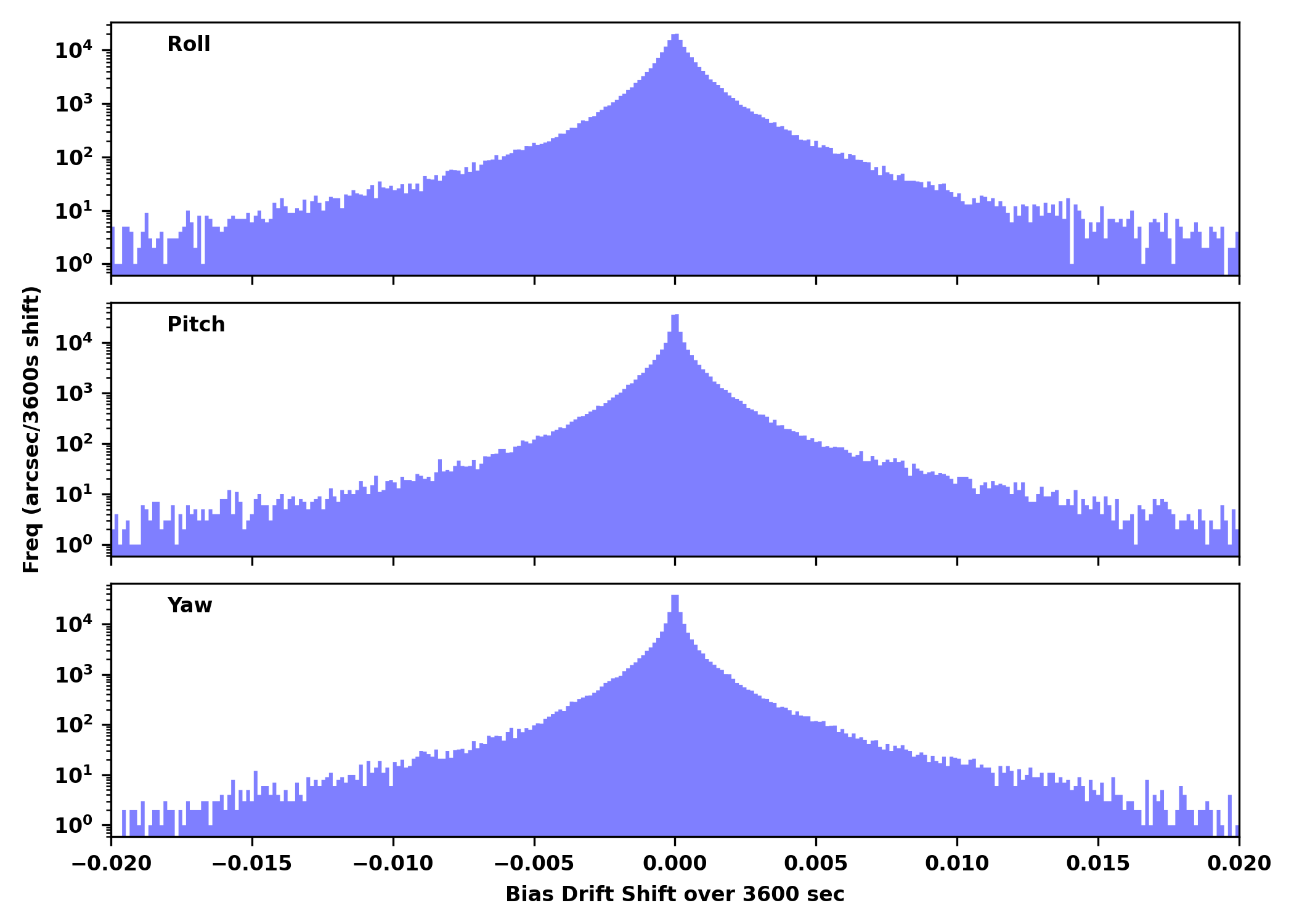
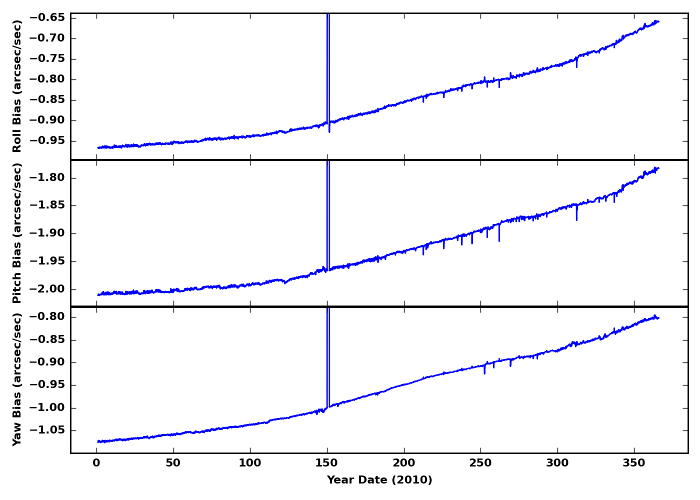
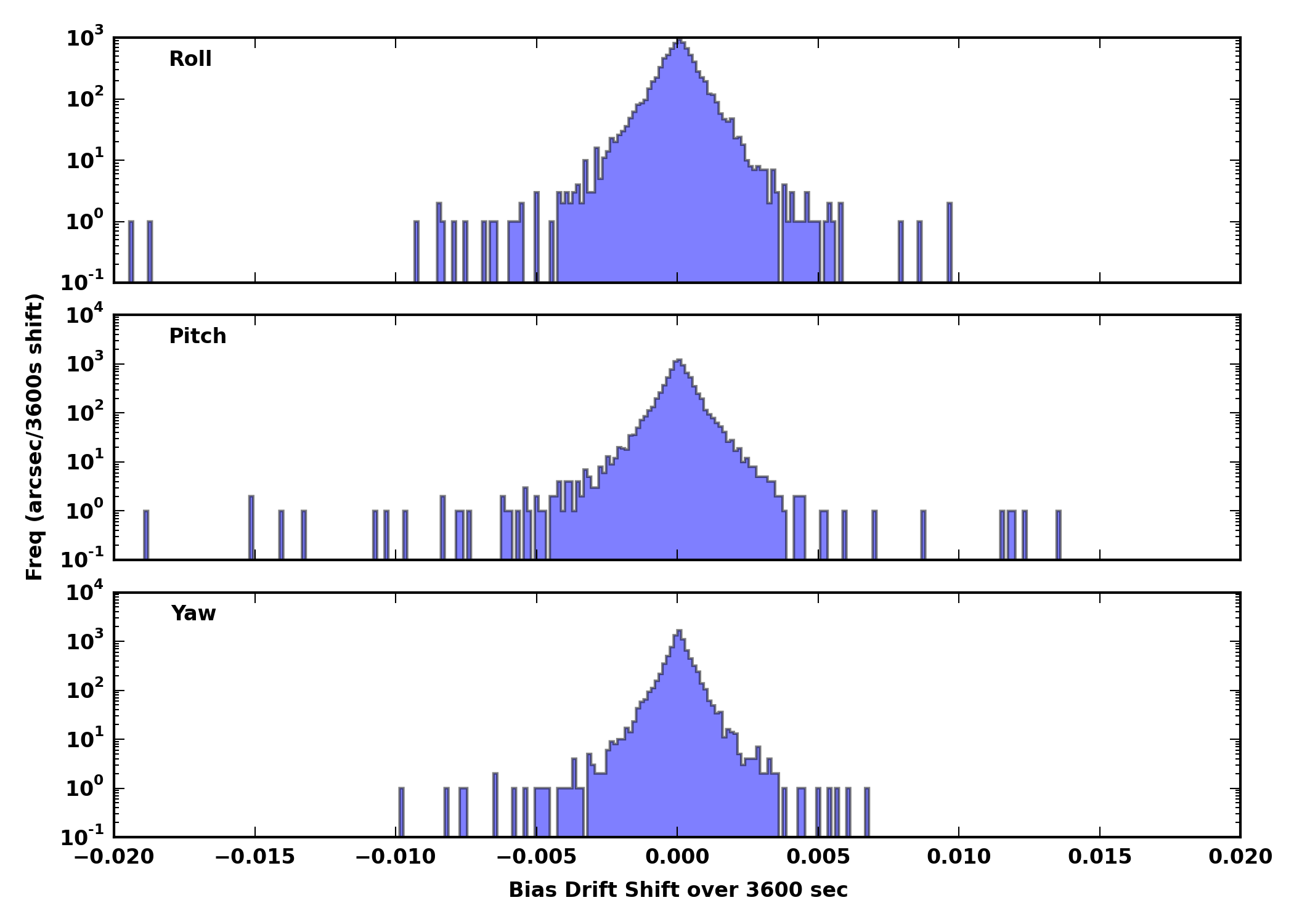
The left plots below are time trends of IRU gyro biases. The first panel shows the roll bias, the second panel shows the pitch bias, and the bottom panel shows the yaw bias. Each data point is an average value over one hour. The unit is arcsec /sec.
The right plots are the histogram of gyro bias shift over one hour. The shift is computed by taking the difference between two adjacent data points (one hour apart). Note that the frequency axis is in log scale.


The y axis range is different from one year to another. The y axis of the histogram is in log scale.


Click the link below to open a month long plot of year 2010.
| Jan | Feb | Mar | Apr | May | Jun | Jul | Aug | Sep | Oct | Nov | Dec |
|---|
Click the link below to open another year.
| 1999 | 2000 | 2001 | 2002 | 2003 | 2004 | 2005 | 2006 | 2007 | 2008 |
|---|---|---|---|---|---|---|---|---|---|
| 2009 | 2010 | 2011 | 2012 | 2013 | 2014 | 2015 | 2016 | 2017 | 2018 |
| 2019 | 2020 | 2021 | 2022 | 2023 | 2024 | 2025 | 2026 |
If you have any questions about this page, please contact swolk@cfa.harvard.edu
Last Update: Jul 26, 2018