The CIAO Contributed Scripts: Always Improving
Antonella Fruscione, Kenny J. Glotfelty, Nicholas P. Lee, for the CIAO team
CIAO (Chandra Interactive Analysis of Observations) comprises a suite of software tools, applications, and scripts developed at the Chandra X-ray Center (CXC) to process and analyze data from the Chandra X-ray Observatory (Fruscione et al. 2006). CIAO is also compatible with data from various other astronomical observatories, both ground- and space-based.
A crucial component of CIAO is the Scripts & Modules Package, also known as "the CIAO contributed scripts." This package houses analysis scripts and Python modules authored by members of the CXC Science Data System group. Broadly, these scripts automate repetitive tasks and enhance the functionality of the CIAO software package to address specific analysis requirements. Often, the scripts originate from requests within the astronomical community to simplify complex tasks or in response to challenges identified through HelpDesk tickets. The scripts cover all facets of data analysis, from data retrieval and preparation to imaging and grating analysis, encompassing references to Point Spread Functions (PSFs) and an array of utility scripts and Python modules.
This article briefly showcases some of the latest scripts introduced in the past year (in no particular order) and directs users to the accompanying documentation, which provides guidance on their utilization.
statmap: creating mean energy maps
statmap is employed to calculate simple statistics (mean, median, sum, min, max, and count) of a column in an input event file, based on spatial groupings defined by the input map file. For instance, users can utilize this script to compute the mean energy of events adaptively binned with CIAO tools like dmnautilus, dmradar, or other adaptive binning tools.
The thread "Creating mean energy maps" provides a comprehensive guide on how to generate a map illustrating the mean energy of events. This process is not only efficient, but the thread also serves as a resource to guide and inform users preparing for subsequent spectral fitting procedures.
It is essential to note that although the mean energy map may be likened to a pseudo-temperature map, the results from statmap should not be directly interpreted as the "temperature map." Techniques such as those outlined by David et al. (2009) have been developed to "calibrate" the type of mean energy maps this tool produces. However, it is crucial to understand that the primary purpose of this tool is to offer a quick analysis to assist users in conducting more detailed analyses, particularly in the context of spectral fitting. Users can leverage statmap to identify regions where energy variations occur (e.g., cool cluster cores), but the derivation of actual temperatures should be undertaken with more robust methods.
Figure 1 illustrates an example of the input and output files used and generated by statmap.
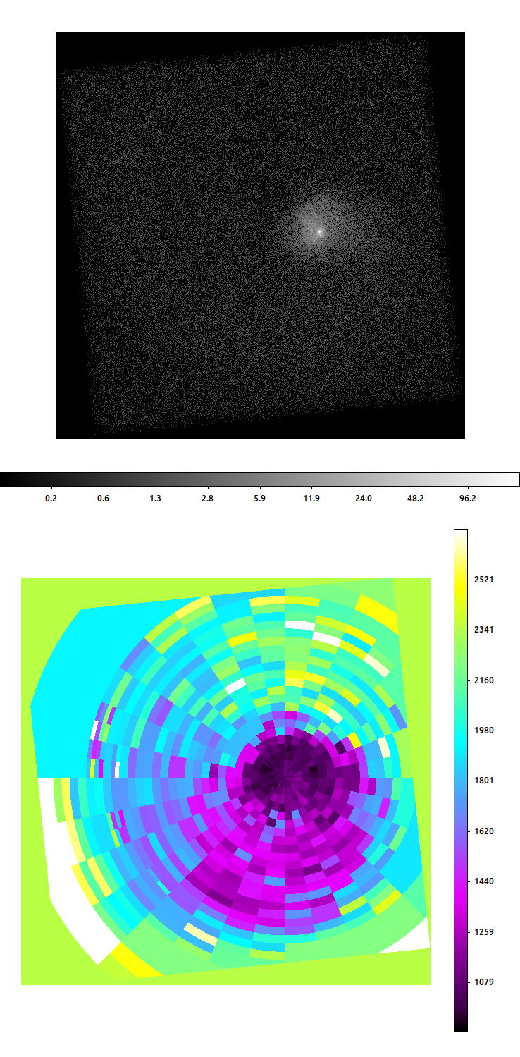
Figure 1: Top: Broad band (0.5 – 7.0 keV) image of NGC 7618 with point sources removed. Bottom: Median energy map of this galaxy generated by statmap from an image adaptively binned with dmradar. Units are eV.
psf_contour: generating a source region file from a simulated PSF
psf_contour simulates a monochromatic PSF at an input source position using MARX (the Chandra on-orbit performance simulator) and subsequently generates a region that encompasses a specified fraction of the PSF. This region is suitable for use as the source region for point sources.
The user has multiple options for the type of region to create: a polygon contour, a city-block "lasso" contour, an ellipse fitted to the contour, a convex hull around the contour, or an ellipse determined from the PSF (see Figure 2). Users can generate regions for multiple targets at the same time by providing an input table with a list of coordinates; the script will generate regions for each source position. Following the initial region creation, the script checks for any overlap among the regions. If overlap is detected, the script adjusts the requested PSF fraction for both sources and regenerates the regions. This process repeats until the overlap is resolved or until both sources reach the minimum PSF fraction, 0.6 (60%). If the latter occurs, the tool ceases attempts to further shrink the regions and excludes the source regions from each other.
Figure 2 (right) illustrates a comparison of regions created by various CIAO tools and scripts.
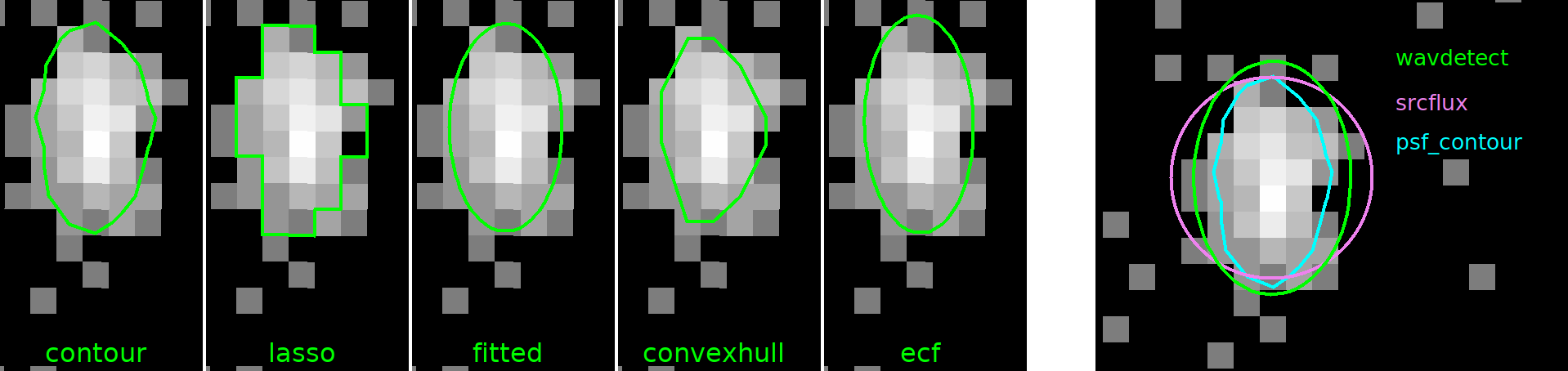
FIgure 2: Left: Different types of regions generated by psf_contour all enclosing 90% of the PSF at 1.0 keV. Right: Comparison of the regions created by wavdetect, srcflux, and psf_contour. The psf_contour region was created as a polygonal region enclosing 90% of the PSF at 1.0 keV.
bkg_fixed_counts: creating a background region with a fixed number of counts
bkg_fixed_counts generates an annular background region enclosing a minimum number of counts around each input source position. The inner radius of each annulus is determined by calculating the size necessary to encompass a specified fraction of a monoenergetic PSF at the source's location. The outer radius is then calculated to enclose the specified minimum count threshold. To prevent the background region from becoming excessively large and potentially non-representative of the source region, users can set a maximum radius.
The background regions are designed to exclude overlapping areas, either due to inner radius overlap or explicit specification of source regions.
Figure 3 illustrates an example of a bkg_fixed_counts run.
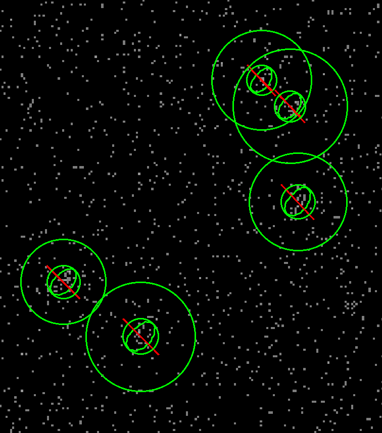
Figure 3: Background annulus regions generated by bkg_fixed_counts. These regions have an inner radius encircling 95% of the source counts at 1.0 keV and an outer radius that encloses 50 counts while excluding source regions.
color_color: creating a color—color diagram
color_color generates a plot of hardness ratios—commonly known as a "color—color diagram"—of a parameterized model for 3 user-specified energy bands. As the model parameters are made to vary and the model is convolved with the response function, simulated spectra are created, simulated counts are totaled, and hardness ratios are extracted in the 3 energy bands. As a default, color_color uses the soft (0.5–1.2 keV), medium (1.2–2.0 keV), and hard (2.0–7.0 keV) energy bands used by the Chandra Source Catalog.
A typical scenario for employing hardness ratios is when there are insufficient counts detected from a source to achieve a statistically meaningful spectral fit. This script enables users to estimate model parameters from the derived color-color diagram. An example of the outputs of this script—including a comparison between multiple observations—is shown in Figure 4.
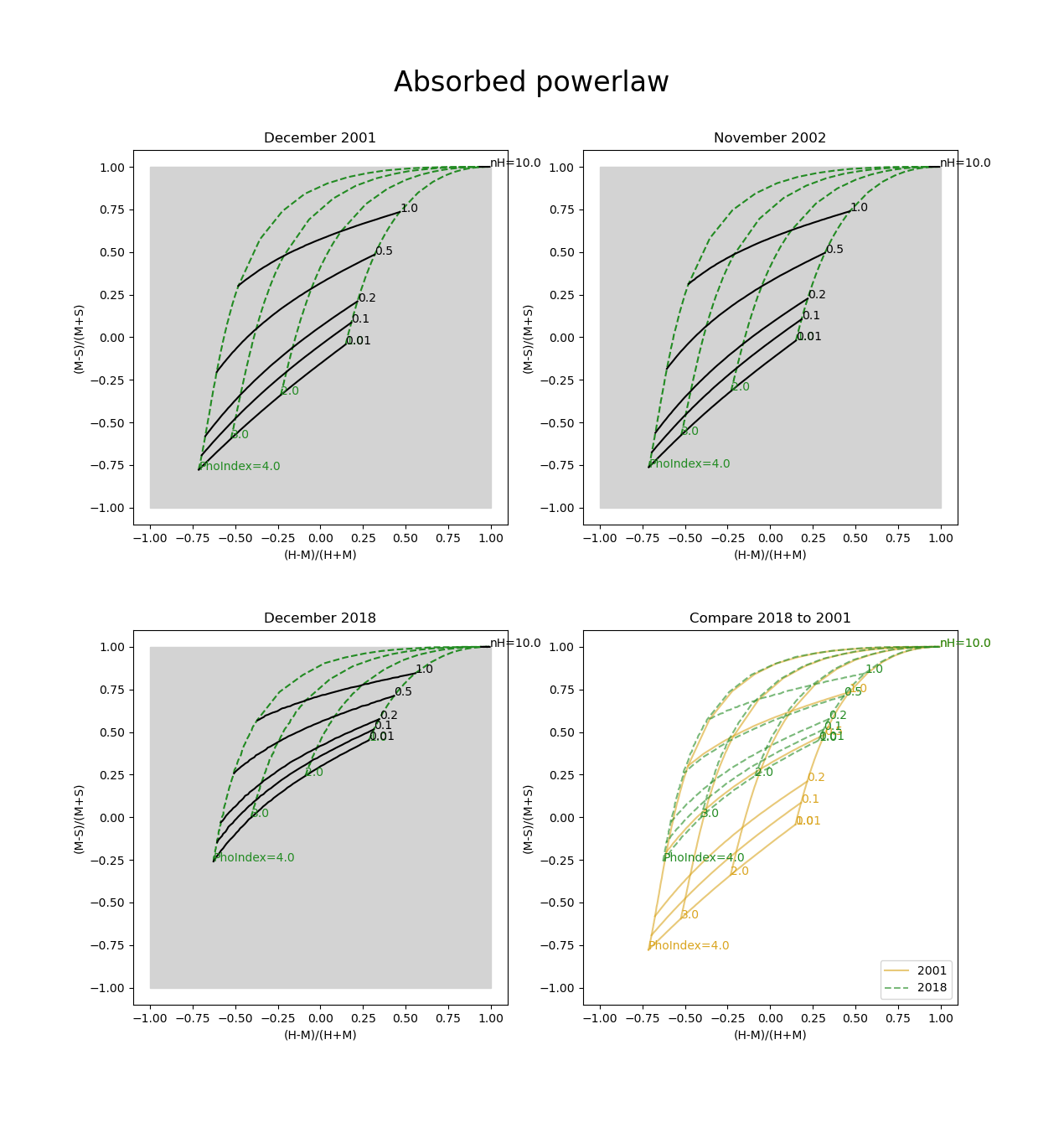
Figure 4: Example of hardness ratio color–color diagrams generated by the color_color script for different observations of the same source model—here an absorbed power law—imaged in observations taken in 2001, 2002, and 2018. The effect of contamination causes the 2018 diagram to appear harder because of the loss of low energy flux.
DAX for grating spectra: identifying locations of energies in Chandra dispersed grating spectra
DAX (Ds9 Analysis eXtensions) constitutes a comprehensive collection of CIAO tools and scripts seamlessly integrated with SAOImageDS9 through its analysis menu interface. This integration facilitates user access to various CIAO tools and applications through a user-friendly graphical interface (newsletter article by Glotfelty et al., 2020).
A recent enhancement in DAX introduces a new option within the coordinates analysis menu specifically designed to identify the location of energies in Chandra dispersed grating spectra. To access this feature, in DS9 navigate to Analysis → CIAO tools (DAX) → Coordinates → Interactive Grating Coordinates Vector.
Once a gratings event file is loaded into DS9, users can dynamically compute grating coordinates (Arm, Order, TG_R, TG_D, Energy) by manipulating the end of the vector in the ′Interactive Grating Coordinate Vector′ as they would a standard DS9 region. The starting point of the vector (no arrow) corresponds to the 0th-order location (which is automatically detected), while the endpoint (arrow end) represents the location where grating coordinates are calculated. Real-time updates of the coordinates occur as the endpoint of the vector is adjusted. Notably, for the High Energy Transmission Grating (HETG), the tool automatically switches between the High Energy Grating (HEG) and Medium Energy Grating (MEG) based on the shortest cross-dispersion distance (TG_D).
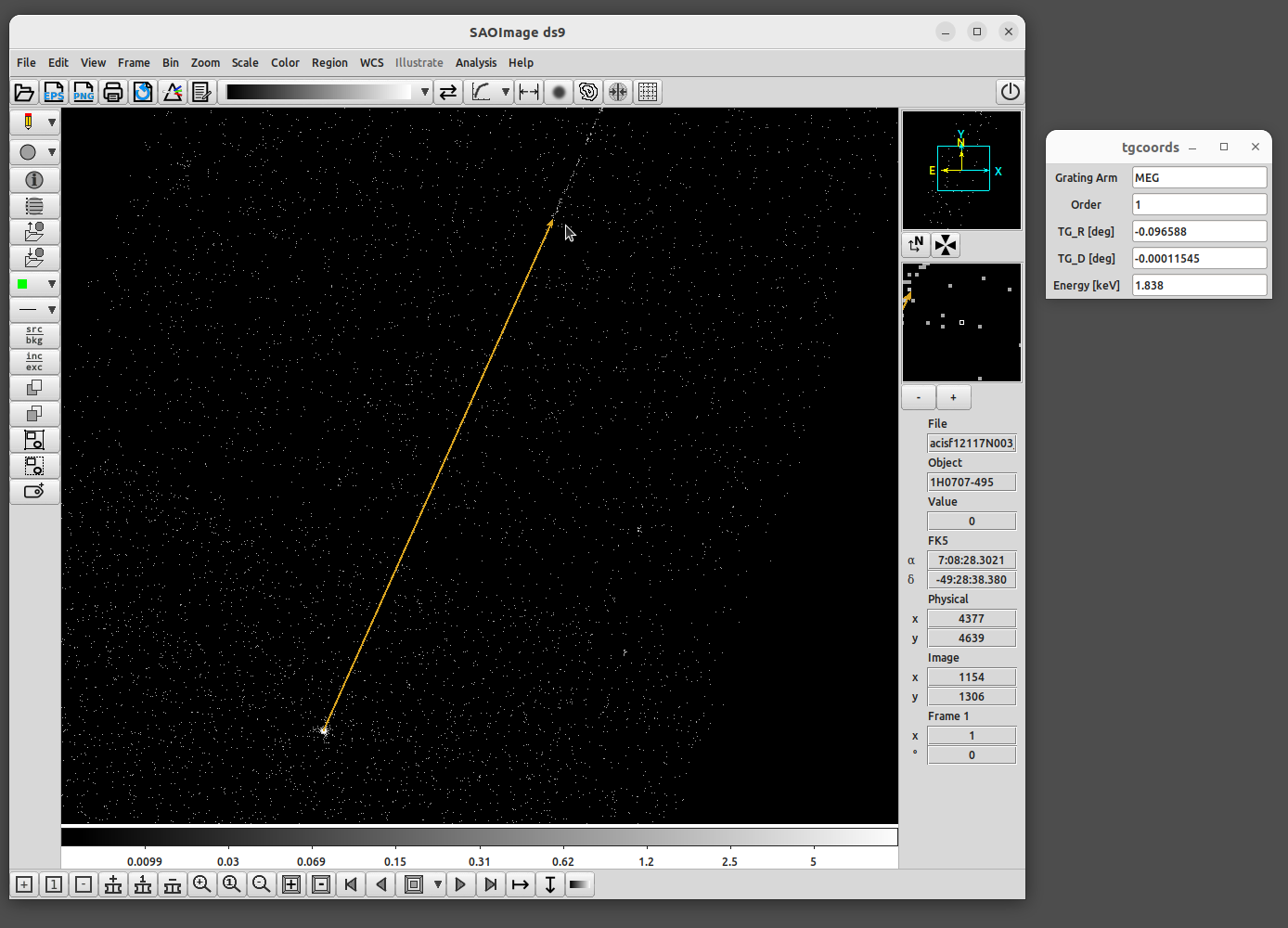
Figure 5: DAX for grating spectra in action. The 0th-order image is at the bottom left of the orange vector, while the arrow points to where coordinates are being measured. Note that this DS9 window is using the Advanced View, which was described in a previous newsletter article (Glotflelty et al. 2022).
resp_pos parameter in specextract: controlling the method to determine the response position.
The resp_pos parameter in specextract is the newest addition to one of CIAO’s essential scripts, designed to extract source and (optionally) background spectra for imaging-mode and zeroth-order grating data.
This enhancement improves the specextract results by introducing multiple methods for defining the position where the response is calculated. Unlike the previous approach, which simply selected the brightest image pixel within the extraction region (represented by the current resp_pos=max option), the resp_pos parameter now provides users with a variety of options tailored to their specific situation.
During the specextract process, one crucial step involves simulating the PSF at a designated location to estimate the PSF fraction. The old default method is generally effective for simple shapes like circles, ellipses, or boxes, assuming the regions are drawn with their centers aligning with the peak of the PSF. However, for regions intentionally excluding the center of the PSF—such as, for example, annuli designed to avoid piled-up cores—a positional shift can result in inaccurate PSF fraction estimations.
The new resp_pos parameter gives users the flexibility to choose a method that aligns with the characteristics of their extraction region. Options include region, centroid, max, and regextent, each described in detail in the specextract help file. For instance, resp_pos=region—defining the position based on the extraction region’s center—would be the appropriate choice for the annulus scenario mentioned earlier.
Figures 6 and 7 illustrate examples of extraction regions and their effect on aperture correction.
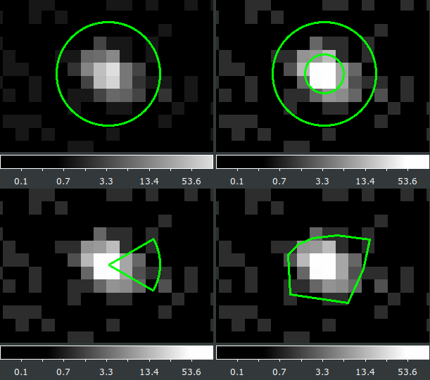
Figure 6: Example of extraction regions (circle, annulus, pie, and polygon) of a point-like source near the ACIS-S3 aimpoint, all referenced to the same coordinates.
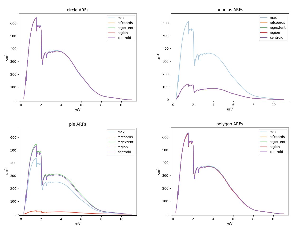
Figure 7: Response functions generated by specextract for the four regions shown in Figure 6, colored by means of determining where to calculate the response. For the circle and polygon, any method is effective, as the center is close to the optimal position and the overall shape encompasses a substantial portion of the PSF. With the pie region, a slight 1–2 pixel shift can have a significant effect. And for the annulus, the default "max" algorithm performs poorly, demonstrating the need for an alternative approach.
And many more
The examples presented above represent just a subset of the numerous CIAO contributed scripts released throughout the last year.
New and updated contributed scripts are periodically released within the CIAO annual release cycle, and the Script Version History maintains a comprehensive record of all changes made to the scripts package. The upcoming release of the CIAO contributed scripts package is scheduled for mid-December, coinciding with the launch of the latest CIAO 4.16 software version.
It is essential to emphasize to the reader that, while these scripts and modules undergo thorough testing, they are considered contributed software and are not CIAO tools. Users bear the ultimate responsibility for ensuring the validity of any scientific results obtained from analyses conducted using these scripts.
Any known issues associated with the scripts and modules can be found in the CIAO bug pages. As always, the CXC encourages feedback from users regarding script usage, documentation, bug reports, or requests for improvements or new scripts to be submitted via the HelpDesk.
REFERENCES
David, L.P., et al. 2009, ApJ, 705, 624 2009ApJ…705..624D
Fruscione, A., et al. 2006, SPIE Proc. 6270, 62701V, D.R. Silvia & R.E. Doxsey, eds. 2006SPIE.6270E..1VF
Glotfelty, K.J., Fruscione A. et al. Chandra Newsletter, Issue 28, Fall 2020, id.7 2020ChNew..28….7G
Glotfelty, K.J., Joye, W., Fruscione A. et al. Chandra Newsletter, Issue 32, Fall 2022, id.6